Grocery Prime
Grocery app designed for convenience | Mobile
Overview
What is Grocery Prime?
Grocery Prime is an app designed to help customers save time while they are grocery shopping in-store.
Problem
A client asked me to research problems that people face in their grocery shopping experience and design a grocery app that would create a better grocery shopping experience.
Target Audience
- Mostly ages 20-30’s
- Primarily based in the United States
- Bachelor’s Degree or Masters’ Degree
- Working full-time or full-time student
- Tech savvy
- Values convenience and efficiency
The Design Process
I divided the project into three manageable parts.
- First, I conducted an initial research to determine specific problems that users had with their grocery shopping and then create an app that would solve for those pain points.
- Second, after creating the app, I conducted usability tests to see whether the app solved user’s pain points and created a smoother shopping experience.
- Finally, based on those results, I iterated on designs and produced final mockups of the app.
User Research
For the initial research, I found 5 people who fit into a target audience to interview and asked them open-ended questions regarding their current grocery shopping experience. Here is the link to interview notes.
Takeaways
Common customer patterns:
- Preferred to shop in-store than online to get better quality produce and catch better deals.
- Went shopping 1-2 times a week.
- Made shopping list prior to going into the store.
- Bought repeat items, quickly in and out of the store.
- Preferred to shop at the same place and are well-versed with the layouts of the store. Asked for help from customer rep when store layout changed.
Common frustrations/pain points:
- Found it unappealing to stand in long lines during checkout.
- Not knowing if an item was out of stock prior to going in-store.
- Unable to find items easily when store layouts changed.
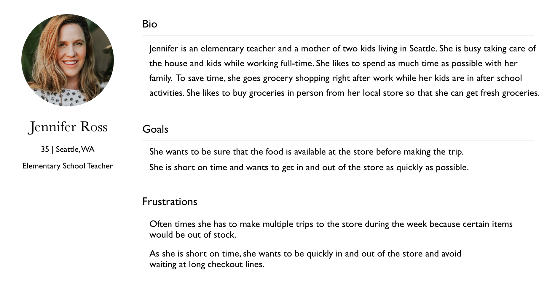
User Persona
Based on the user research, I created a user persona that would help anchor my design decisions throughout the process.
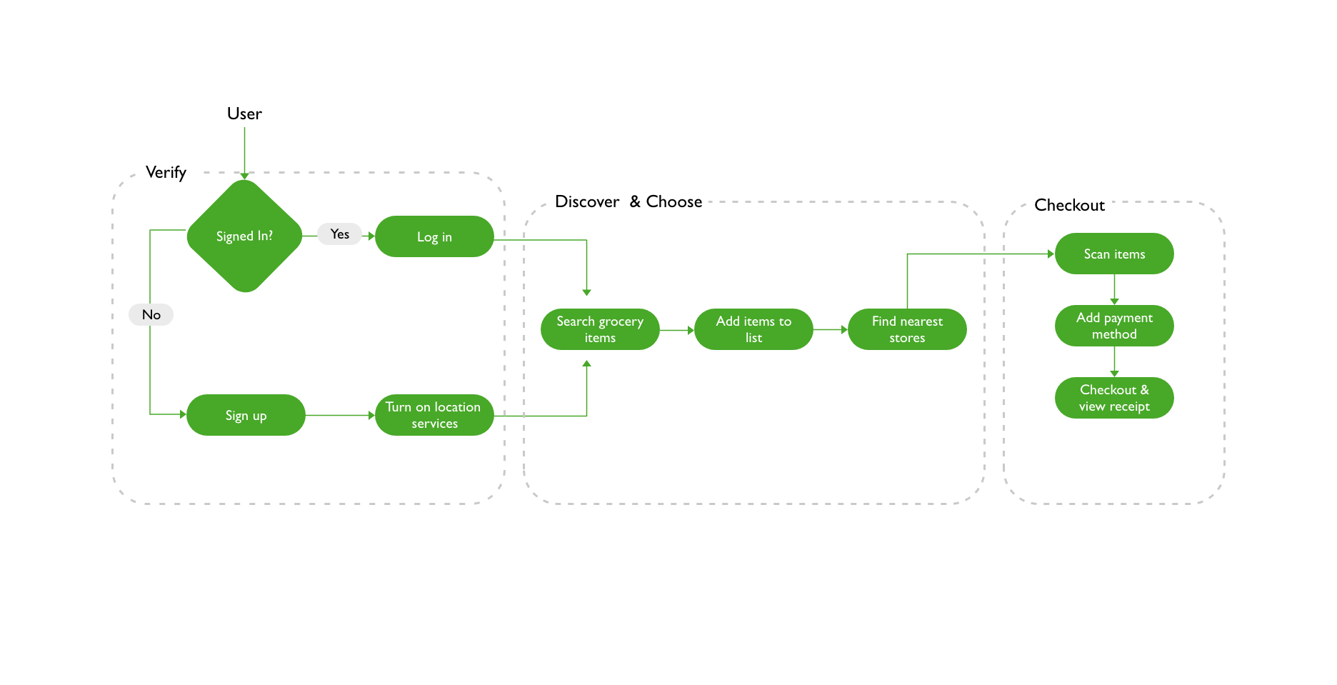
User Flow
I created a user flow that divided the app into three main parts where a user would find items and add them to the list, find nearest stores and then checkout on the app.
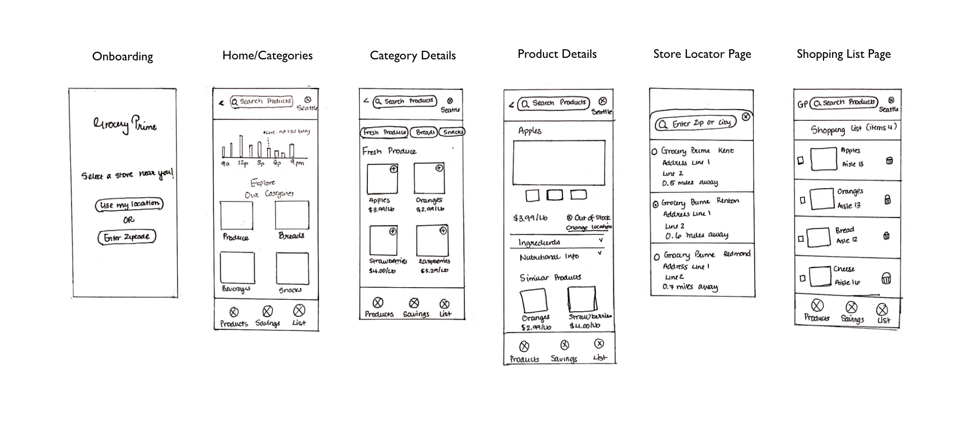
Sketches
Mid-Fidelity Mockups
User Testing
I created a user flow that divided the app into three main parts where a user would find items and add them to the list, find nearest stores and then checkout on the app. Here is the link to interview notes.
Takeaways
What went well?
- Users liked the store time card on homepage. Helped them decide when to go shopping.
- Users found the app neat and clean, were easily able to navigate through the app.
- Users found out-of-stock/available and product location features helpful.
What needs to change?
- Users wanted an option to change store location from category page to save time.
- Users were unsure if an item was added to the list after clicking “add to list” button.
- Users wanted an option to select nearby locations instead of app selecting one on their behalf.
Color & Typography
Solution
In order to solve for user’s pain points, I applied the suggestions I gained from the user testing and made the following changes in the design iteration:
- Added an option to change store location on the category page to save user’s time from going to the product details page to change the store location.
- Added a notification when a customer would add an item to the list to confirm to the user that their item has been added to the list.
- Showed available stores locations near them when they would share their location.
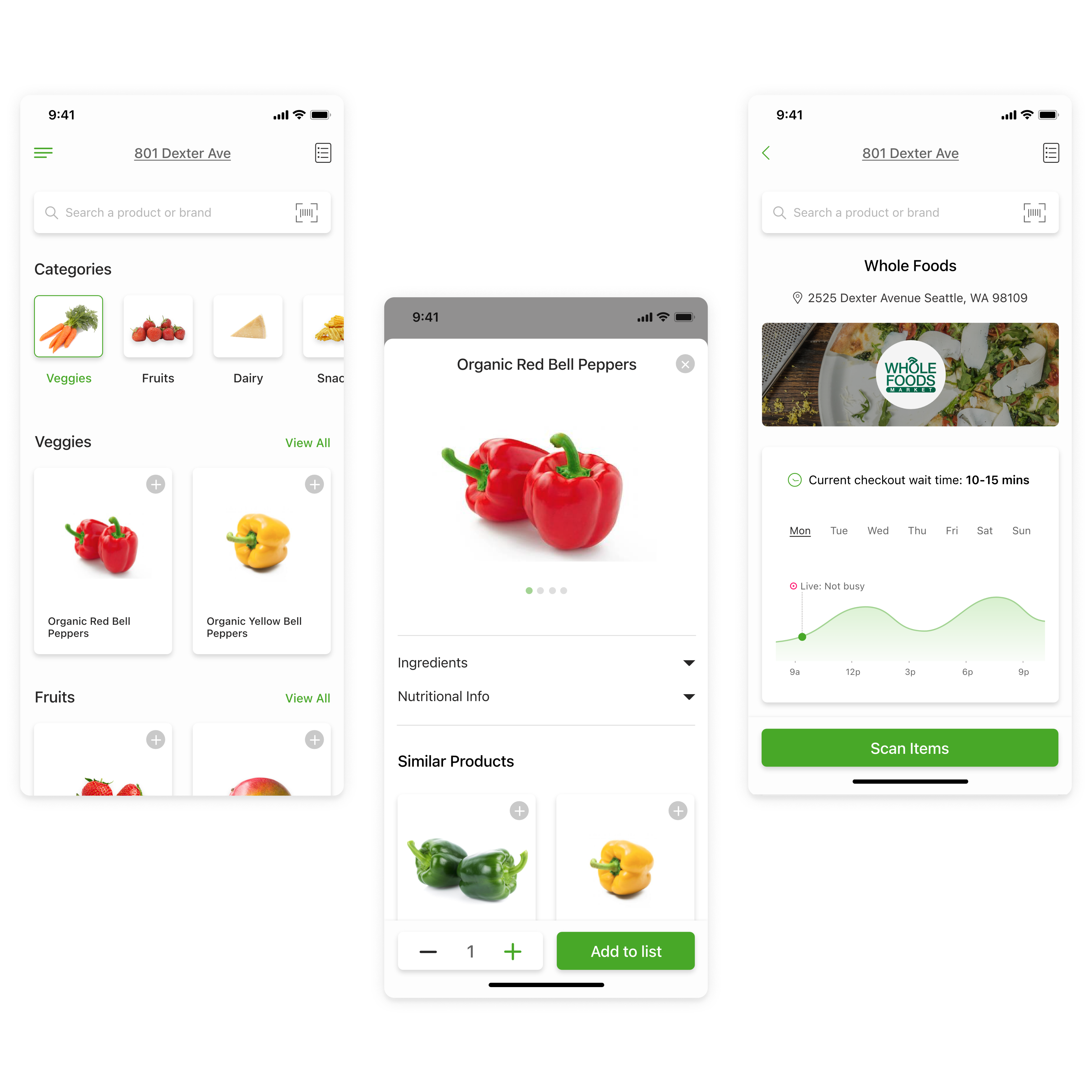
Final Mockups
Summary
What did I learn from this project?
I learned the importance of user research because it helped keep the user at the center of the design process. During each stage, I kept referring back to the user’s needs and asked how might this feature help the user save time while grocery shopping? When I did this, it helped me make design decisions that effectively solved for the user’s pain points.
Next steps:
- Conduct more usability tests on the final mockups to see whether it solves for user’s pain points.
- Solve for different edge cases (manage shopping list for different store locations).
- Add a sort by shortest route option in the shopping list. This feature would provide users with a map that would list where all their shopping list items are located in the store. This would help user quickly collect items in one-go.