Shirts by Mike
Website conceptual re-design | Desktop
Overview
What is Shirts by Mike?
Shirts by Mike is an e-commerce website that sells t-shirts, tank tops and other apparel uniquely designed by students at Treehouse. Their apparel design helps create a sense of community for the Treehouse students.
Problem
Recently, Shirts by Mike were seeing a decline in their apparel sales. They conducted user testing to understand the cause in decline in their apparel sales. They saw that the users dropped off the site without making the purchase due to difficulty in reading the content and navigating the website. They also came to a conclusion that the website looked outdated compared to other e-commerce websites.
How might we design the website so that it would look/function better for its users and increase the sales?
Target Audience
- Mostly ages 16-35
- Primarily based in the United States
- Treehouse students
- Lifelong learners
- Values community
- Playful
Initial Requirements
The initial requirement was to critique Shirts By Mike website, research competitors and then implement design elements that would benefit their customer. The task was to redesign the website so that it would look and function better for its users.
The Design Process
Interpreting the Site
Strengths
- Layout is simple and easy to follow
- Has a clear CTA
- The product images are clear and easy to interpret
Weaknesses
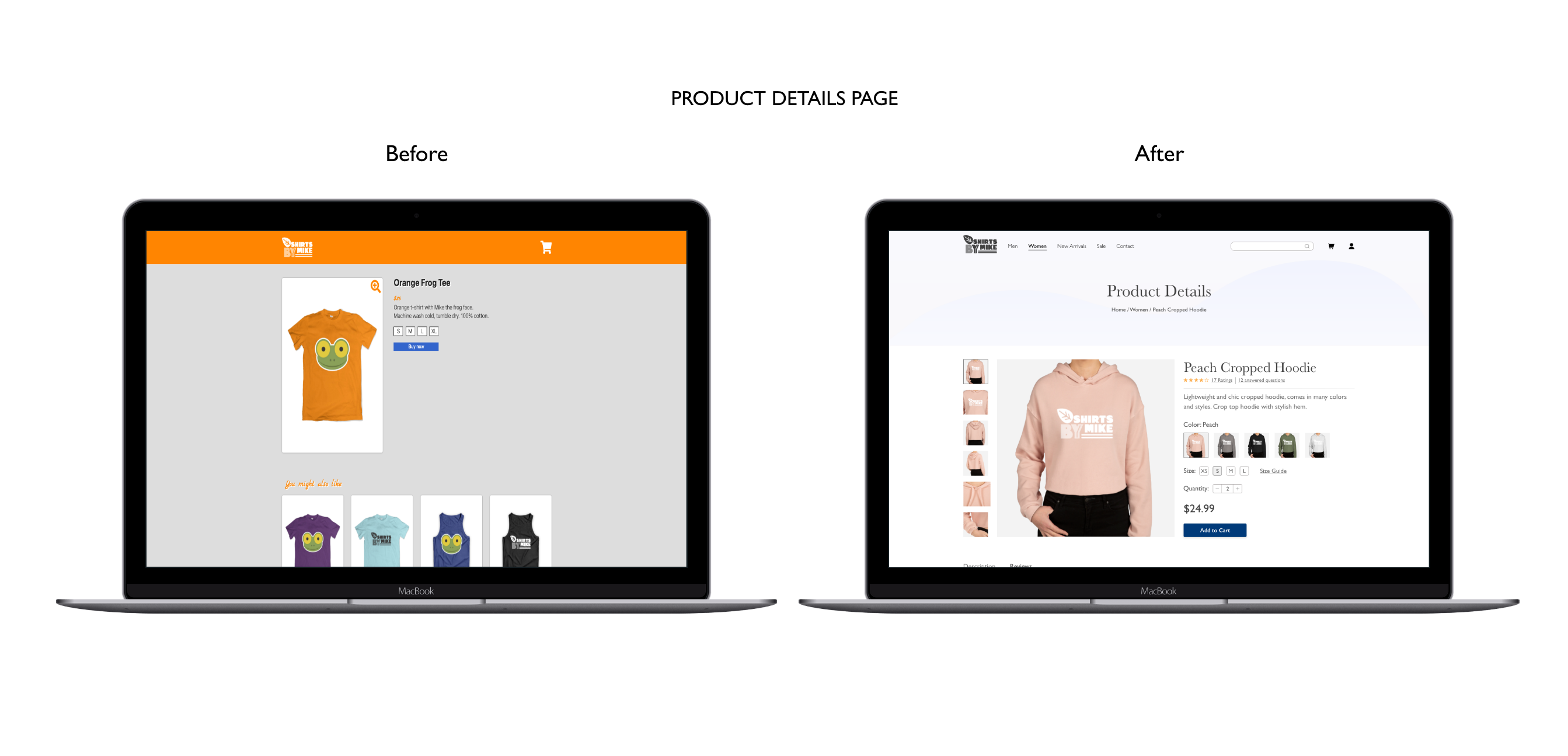
- Low contrast ratio (1.79), makes it harder to read the text and is inaccessible for those with reading disabilities.
- Missing product reviews/ratings, size chart, and color options features on listing's page.
- Missing contact information or information about the company.
- Missing deals/clearance page.
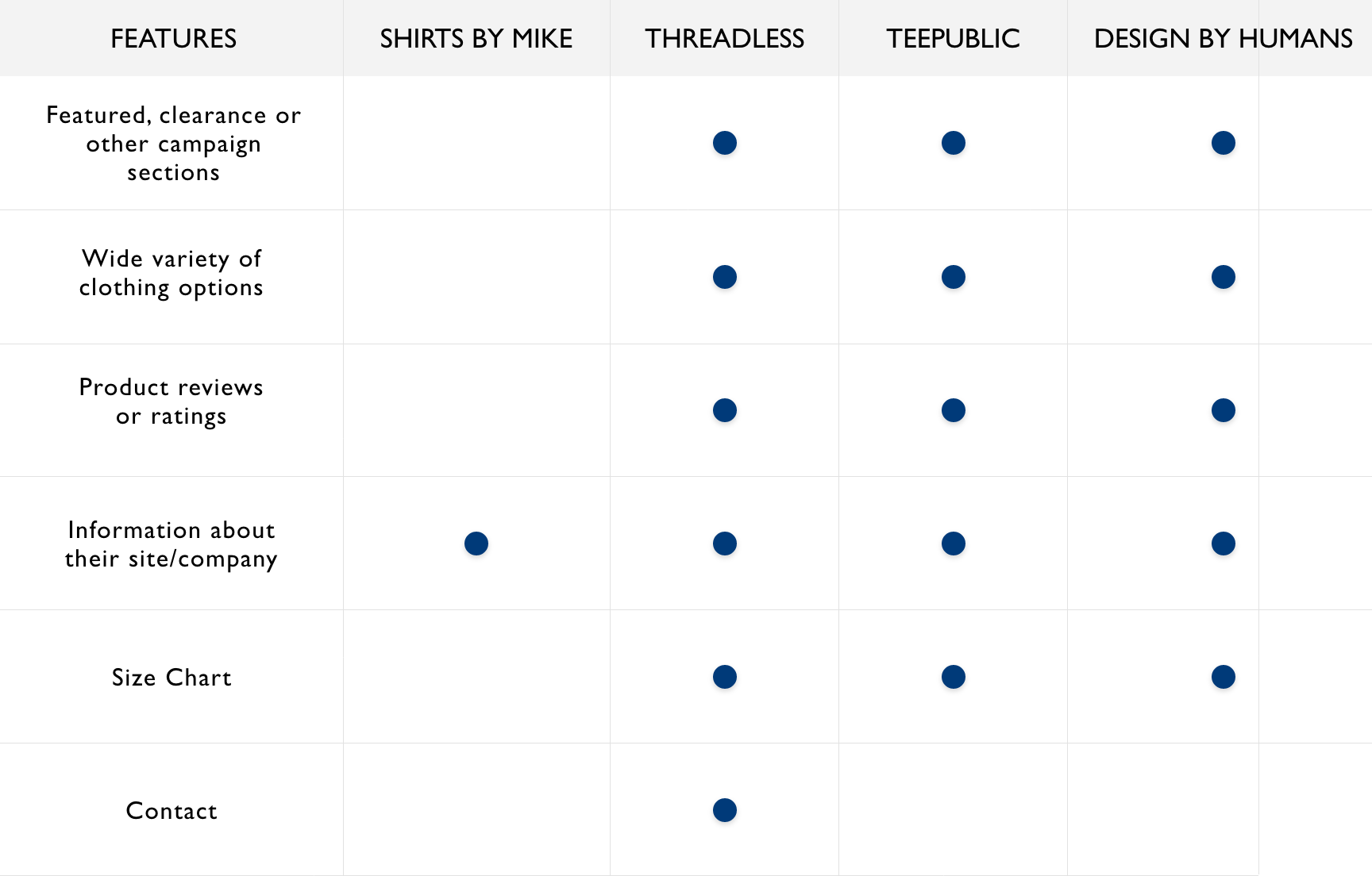
Competitive Analysis
Before diving into the project further, I researched what other similar sites were doing and what was effectively working for them.
Among other sites, I compared Design by humans, Threadless and Teepublic. I noticed that while they all had similar business goals, each of them had a unique style and visuals. I made a list of elements that were on each of these sites and implemented those missing elements to build a better user experience.
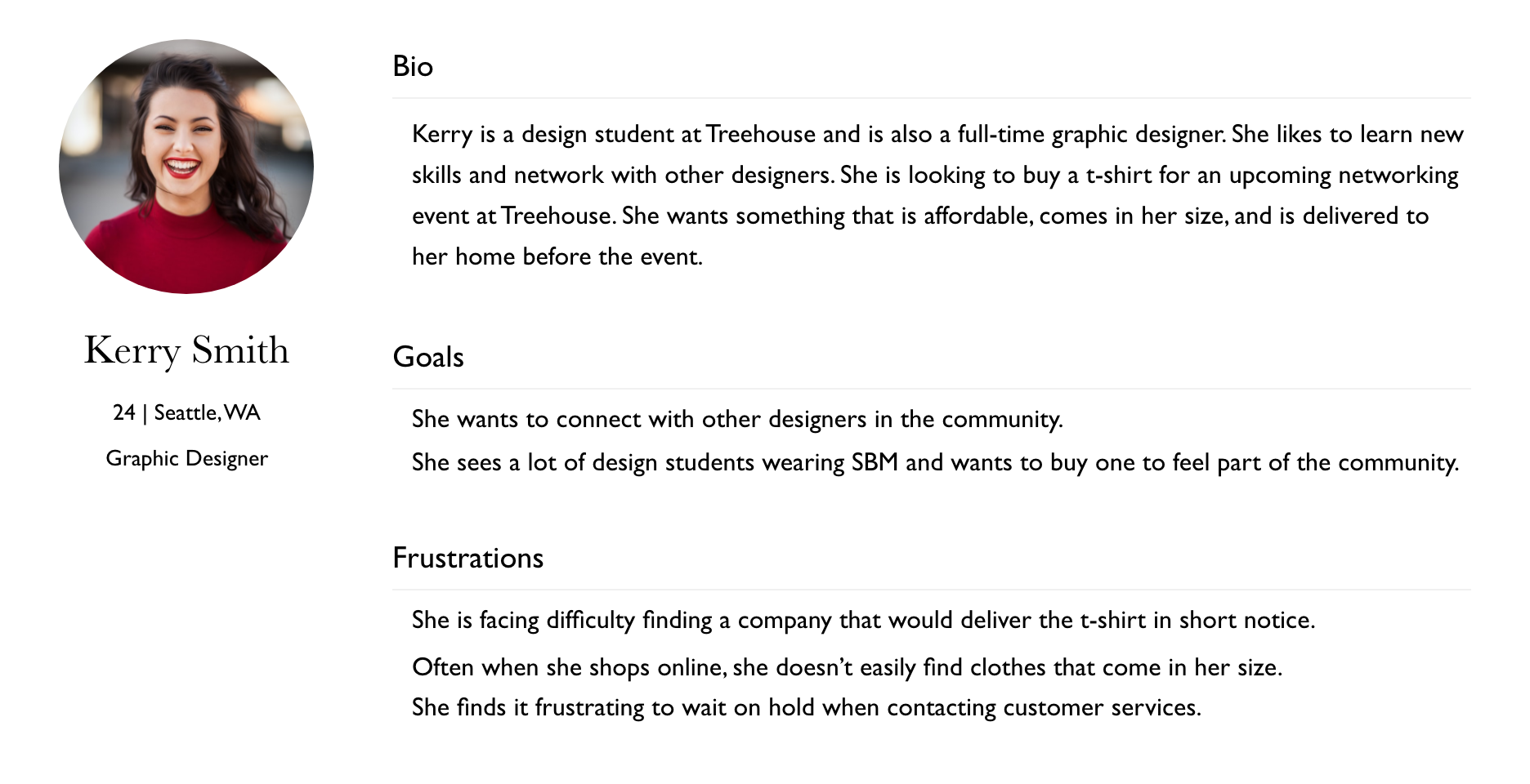
User Persona
After revisiting the target audience of the website, I created a user persona that would help anchor my design decisions throughout the process.
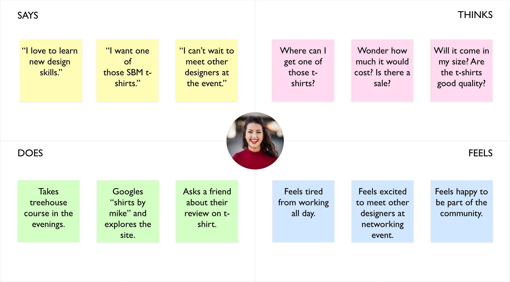
Empathy Map
To better understand the user’s concerns and problems, I created an empathy map. By understanding what Kerry says, thinks, does and feels, I was able to understand she felt nervous about finding the t-shirt that would come in her size and would be of good quality.
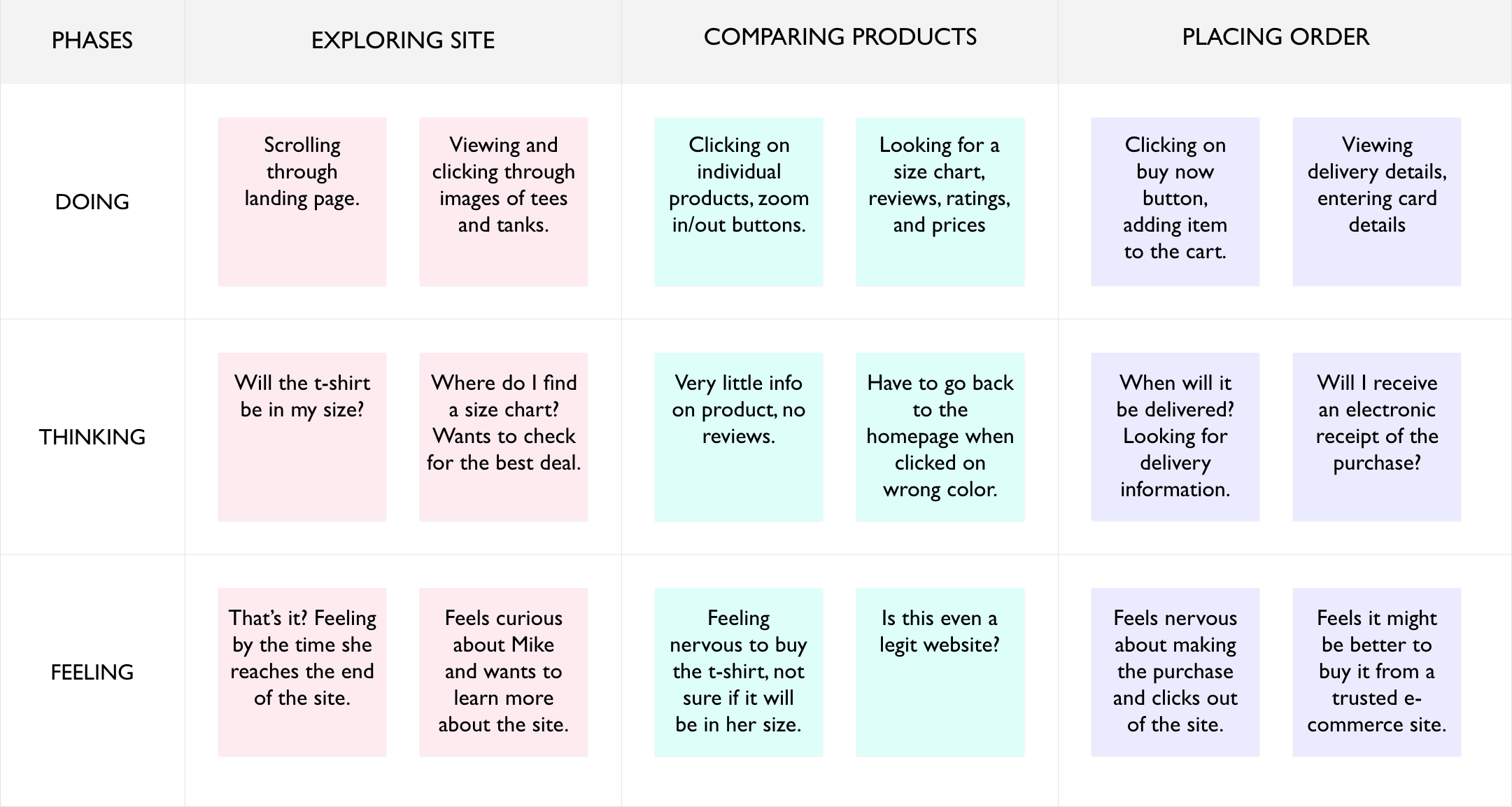
Journey Map
To better understand where exactly Kerry was finding difficulties in the website and her overall experience exploring the site, I created a journey map. The map helped understand her actions all the way from searching for an item to placing an order on the website.
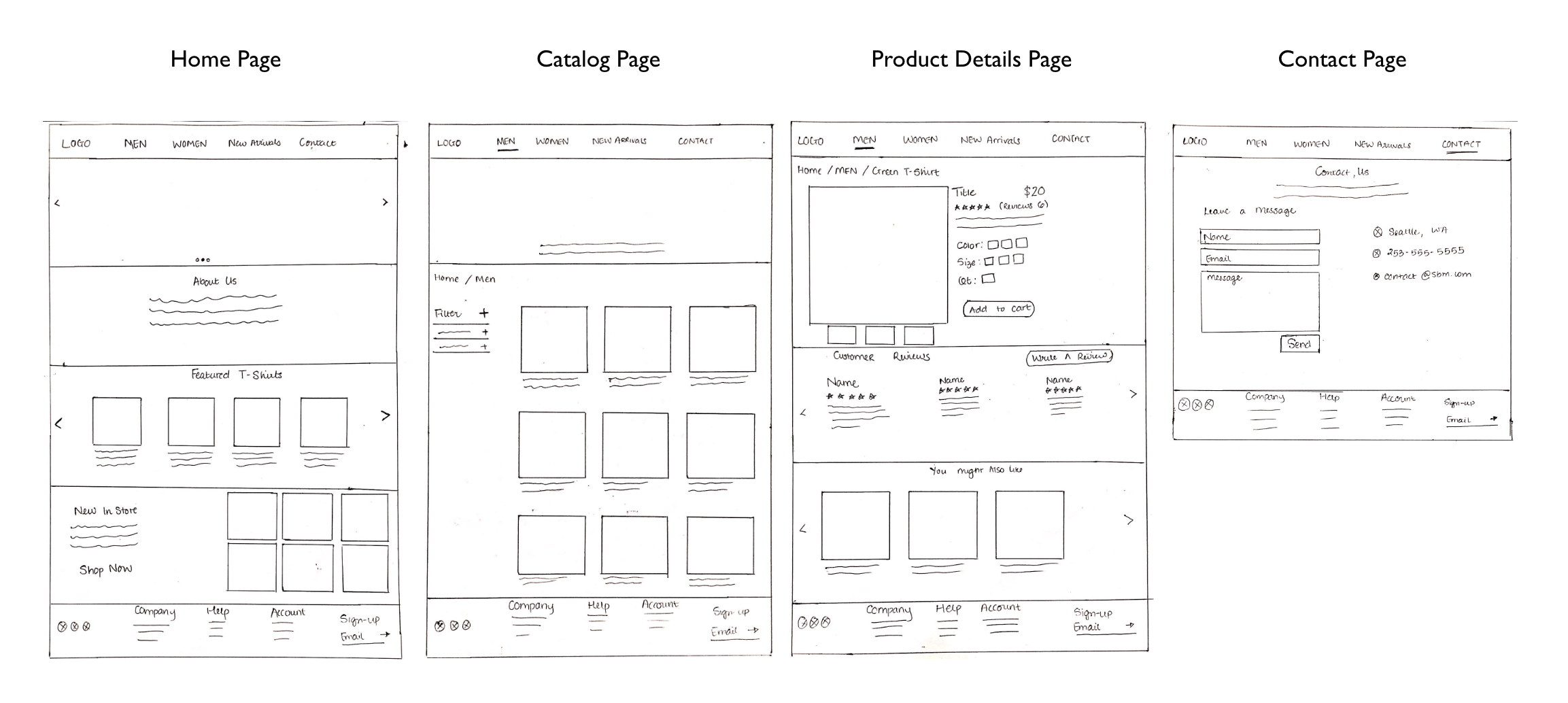
Sketches
I started off by sketching a few different versions of each page. In this stage, I added elements and features that I found would benefit the user during research and structured content in a way that would be clear and easily readable to the user.
Mid-Fidelity Mockups
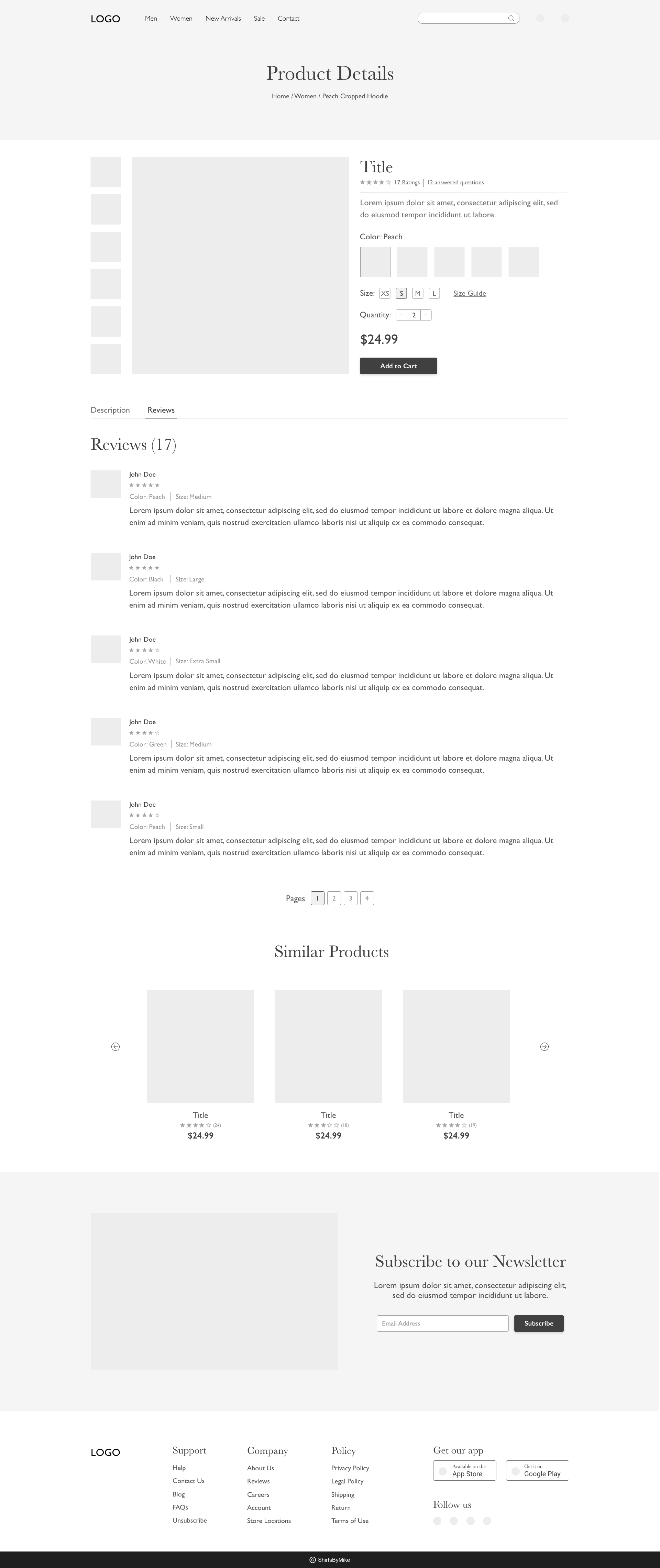
After drawing different versions of sketches, I narrowed down to one version of the sketch. I iterated on the version and created wireframes using Adobe XD. In this stage, my designs had evolved and focused on creating minimalistic design. I also expanded on reviews section on the product details page to help user in the decision making process.
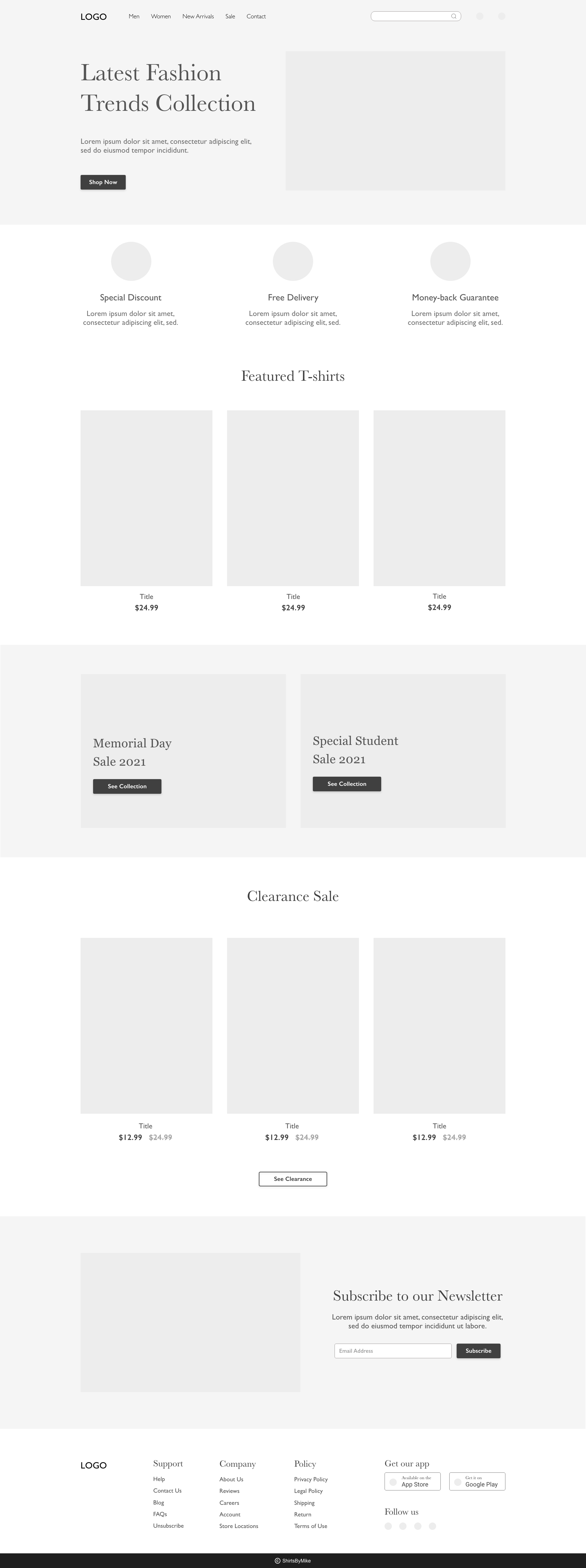
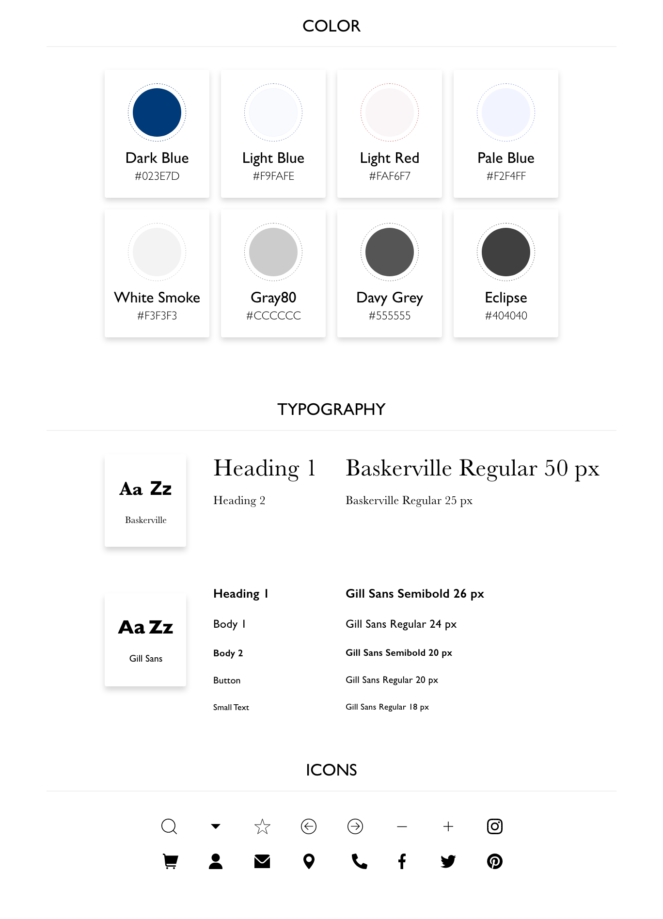
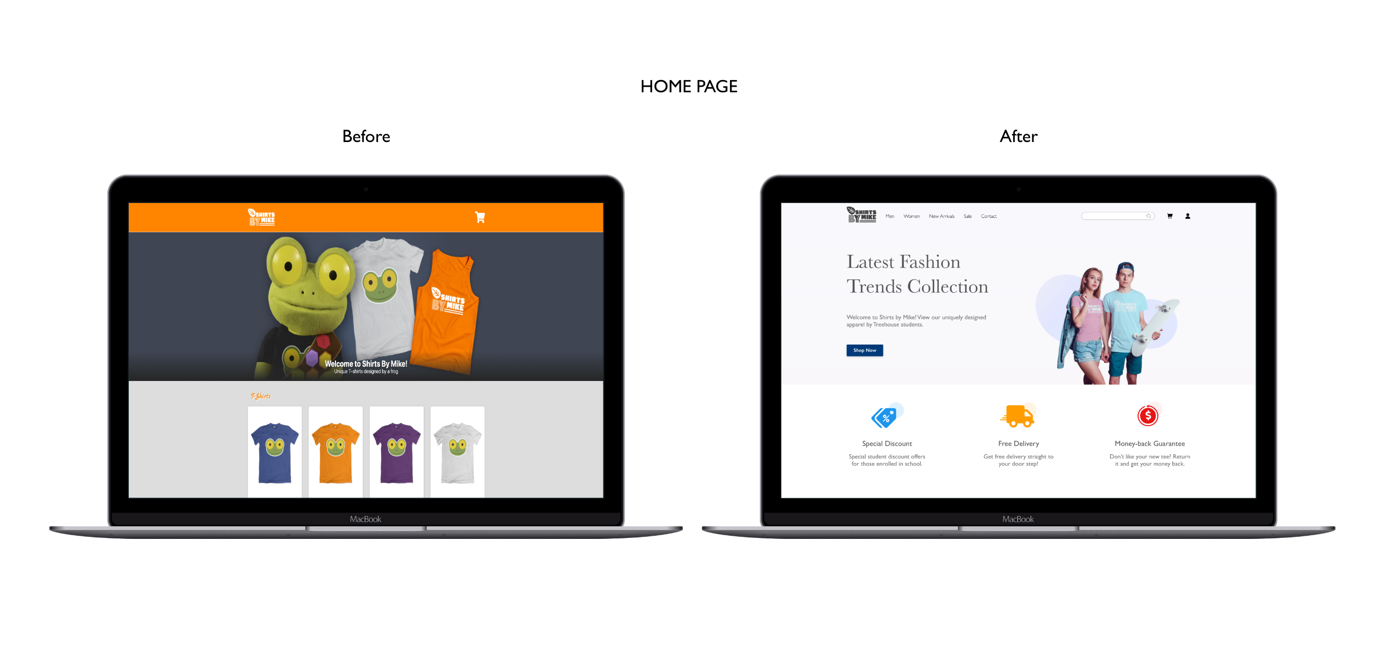
Color & Typography
To make the website look more modern, I decided to choose white as the background color, it helped give the minimalistic look. The white background also helped distinguish images and make the content easily readable.
As for typography, I chose two different typefaces. I used Baskerville for headings and Gill Sans for the body copy. This also helped in creating hierarchy and make the text more readable.
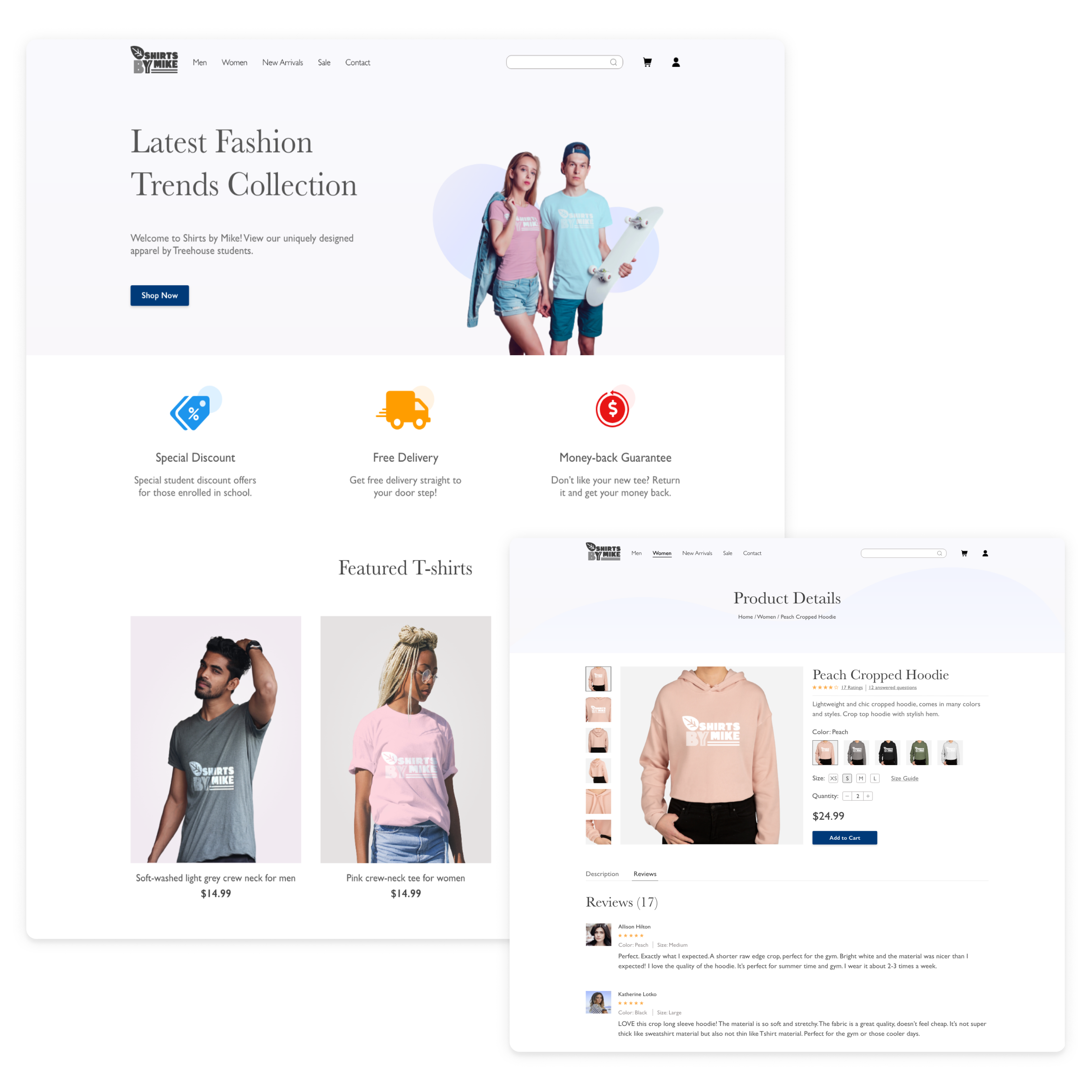
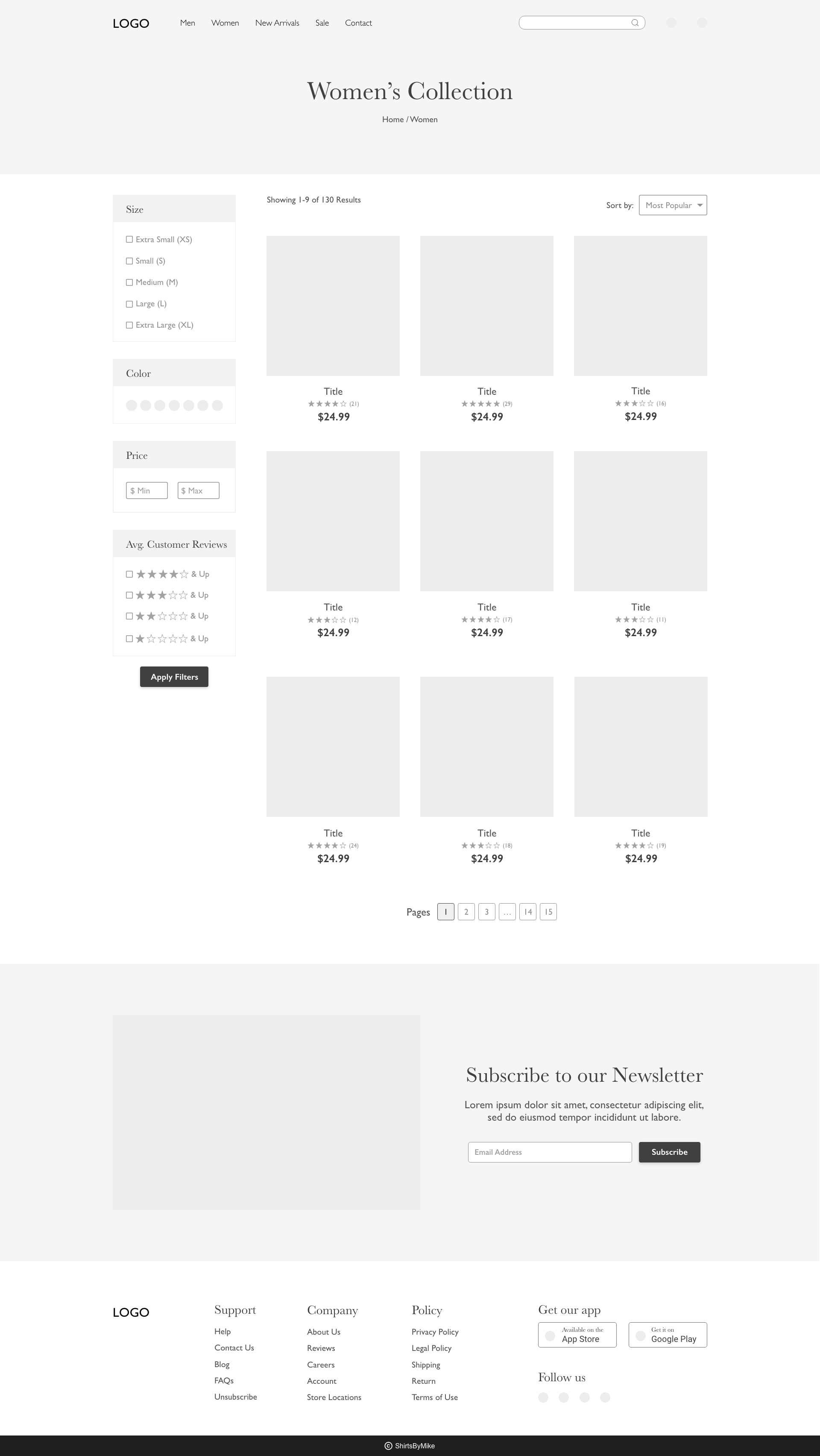
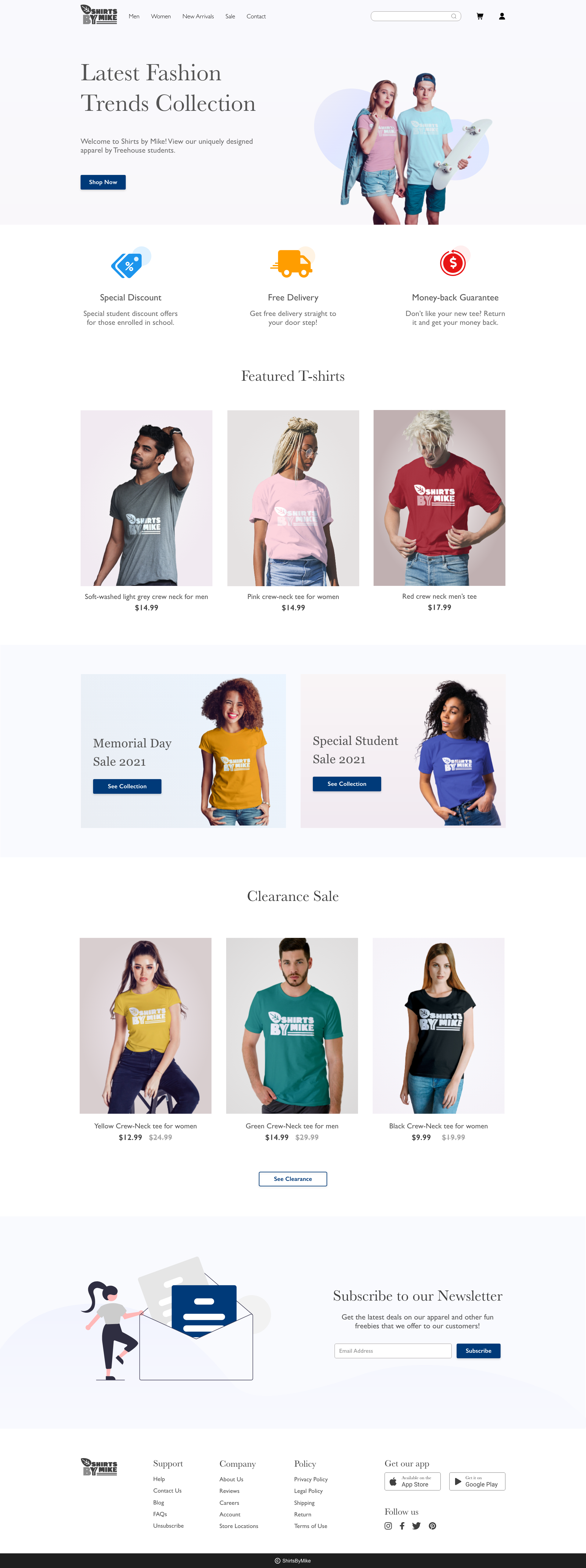
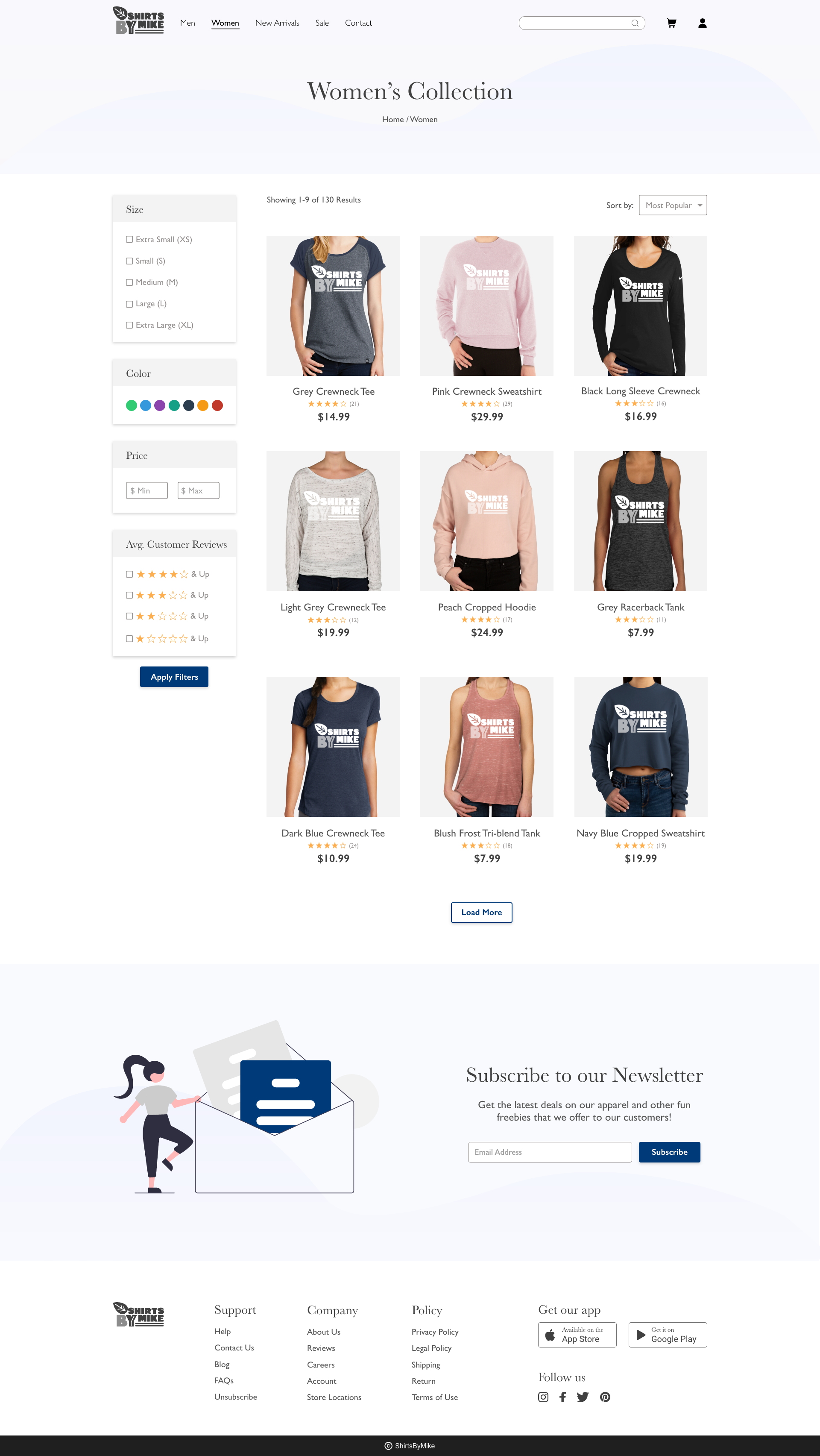
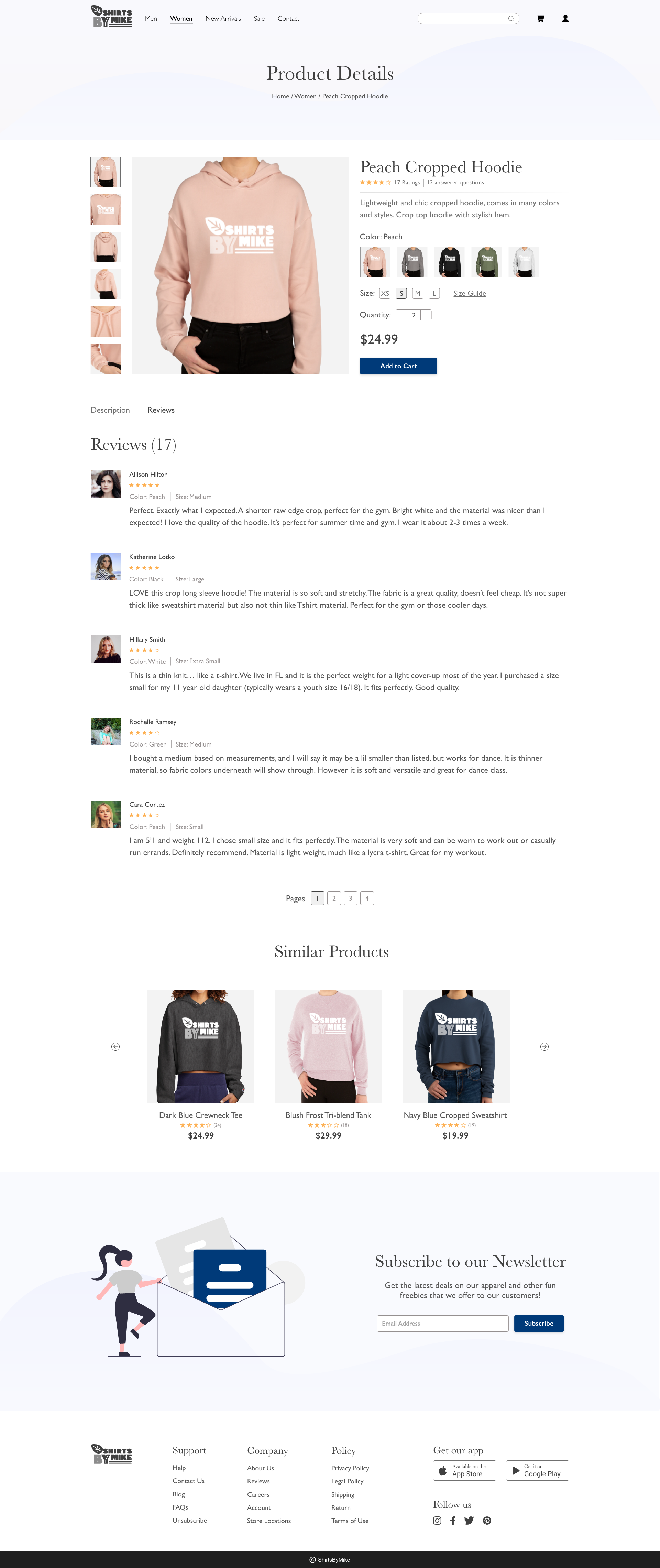
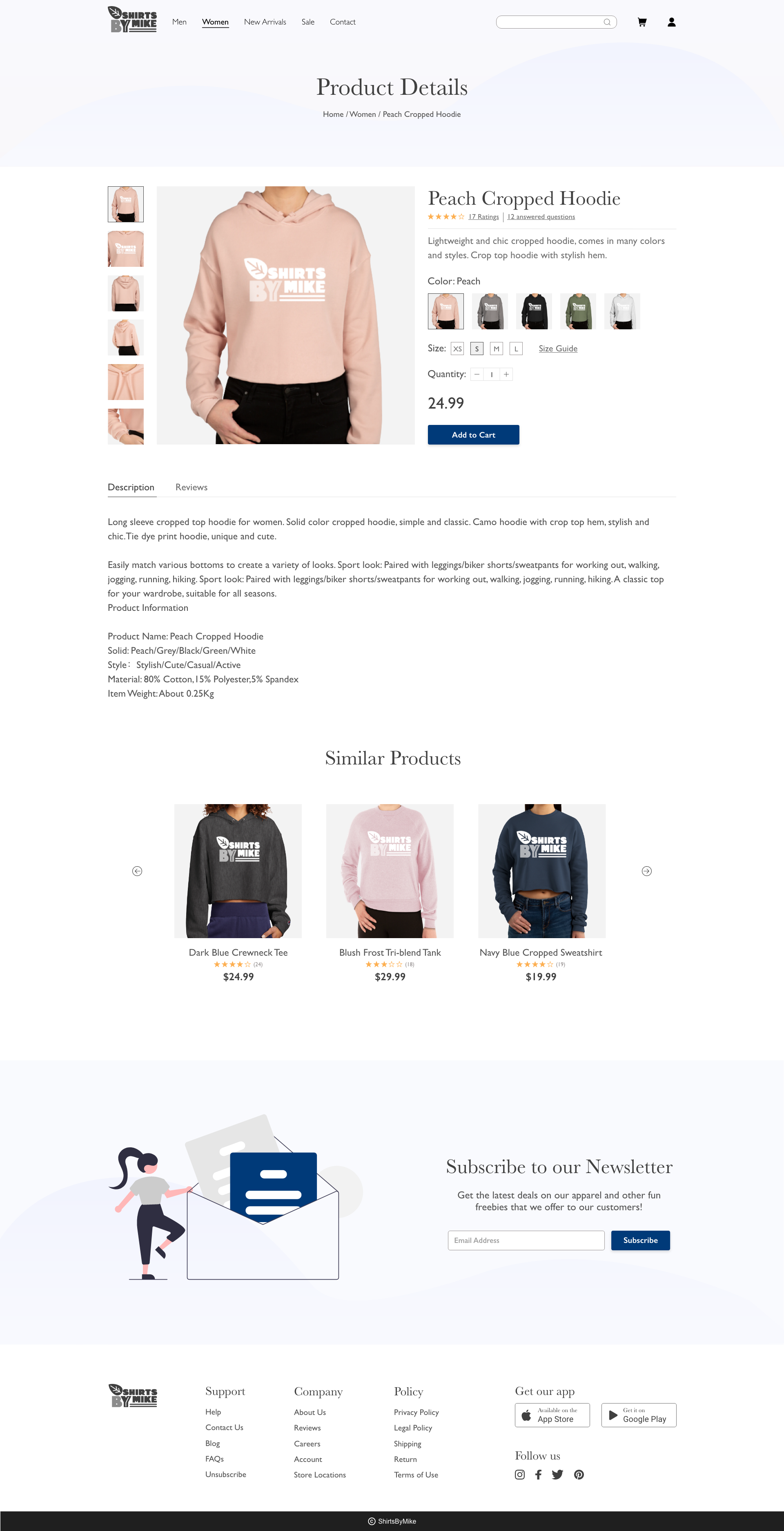
Solution
In this stage, I revisited the user’s pain points when they visited the website and applied the knowledge I gained from looking at other competitors to create a more reliable and trustworthy website.
Here are the features I added in the final version of the iteration:
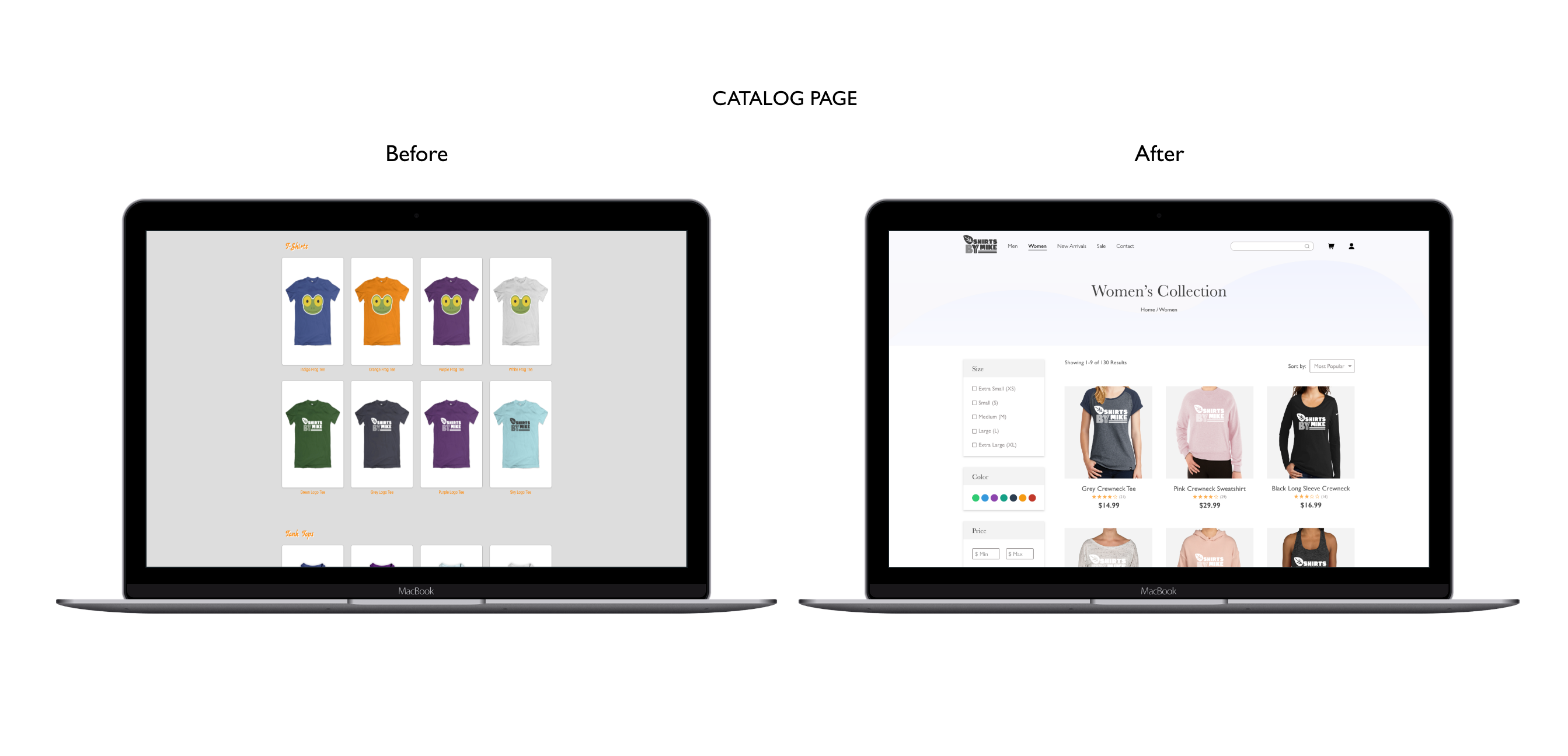
- Added clearance and featured sections to give users more options to choose from.
- Added options to sort and filter through color, size, price, ratings, reviews so that the user can easily get to their desired product.
- Added detailed information about the product (size chart, color, size available, fabric quality) to guide user in their purchasing decision.
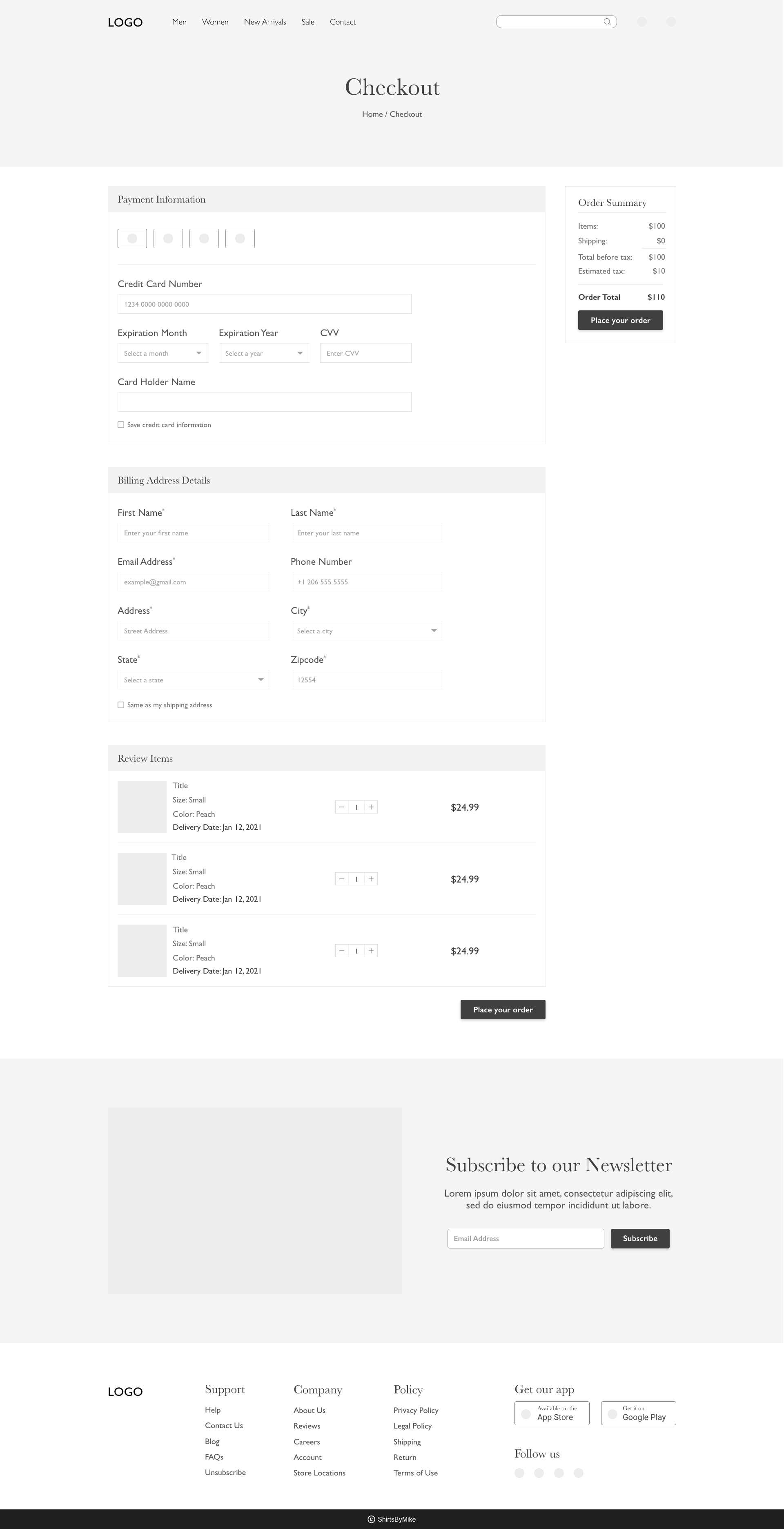
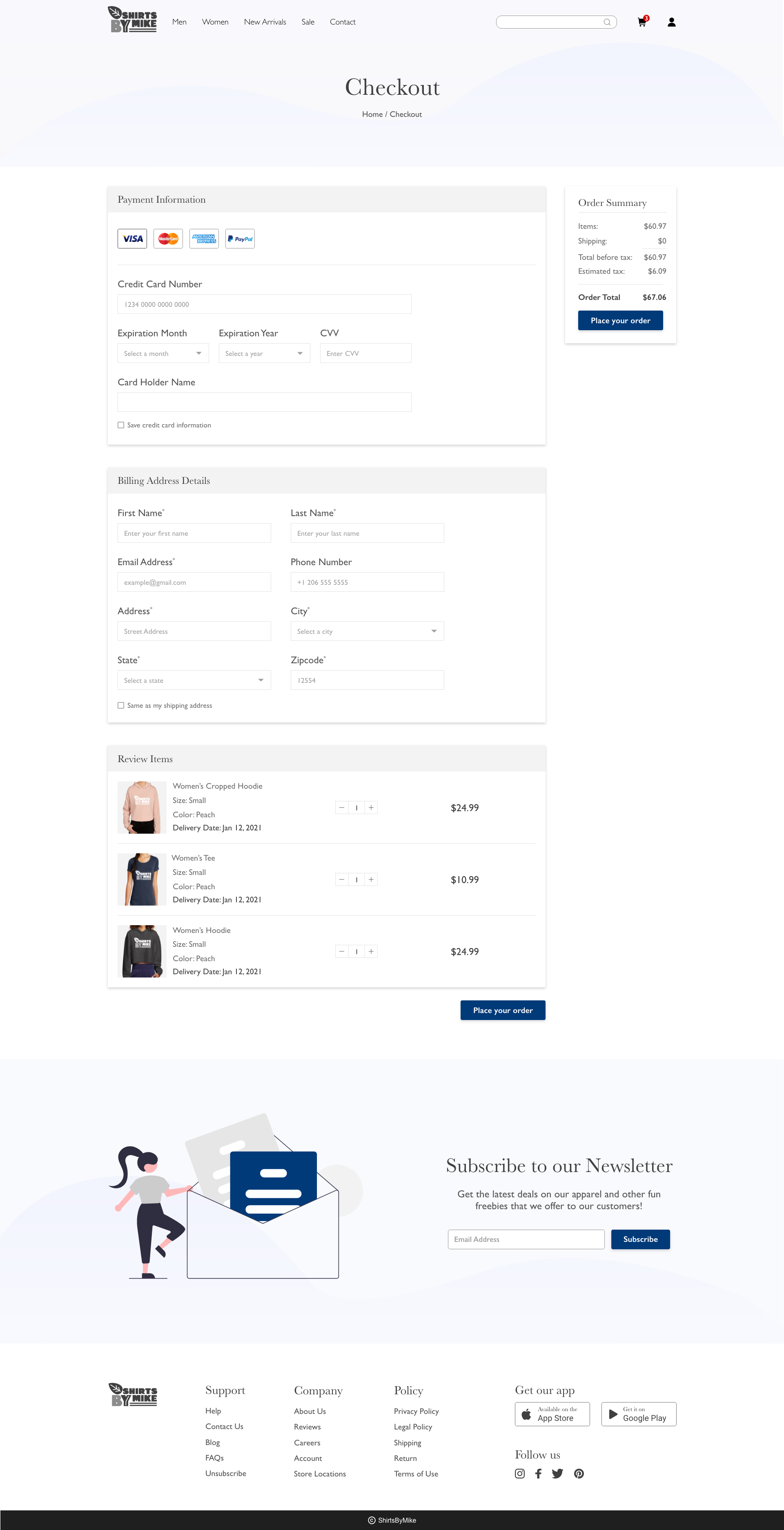
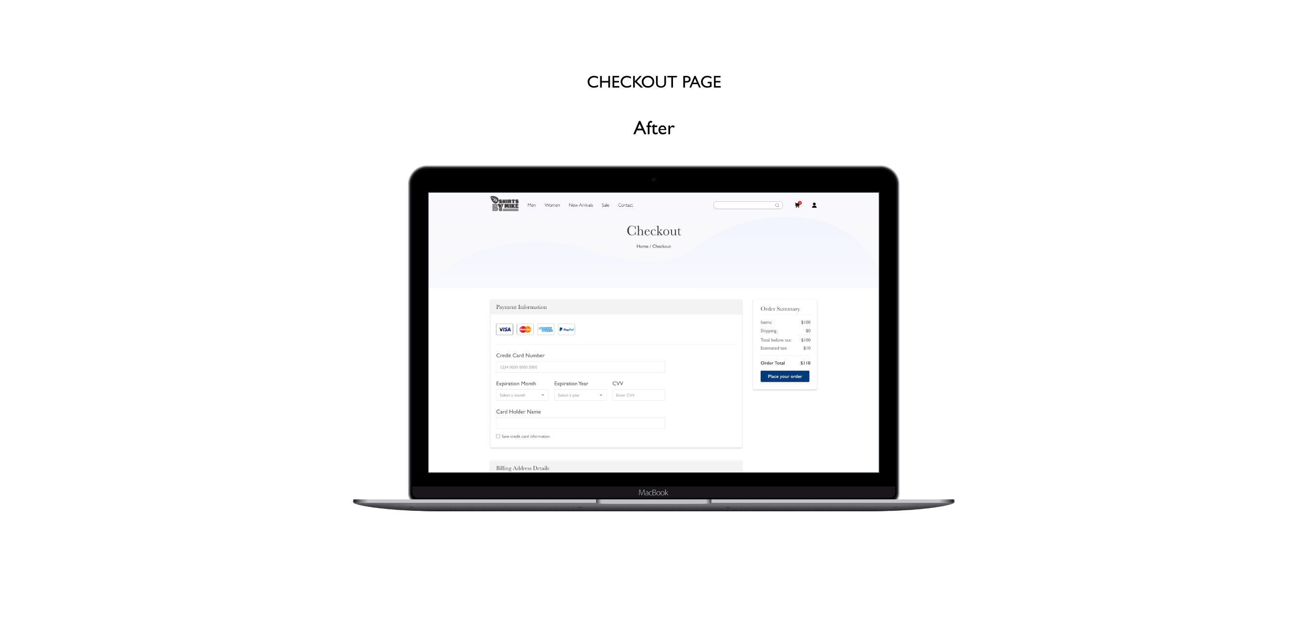
- Streamlined checkout process into one-single page workflow to minimize any friction and allow users to place order easily.
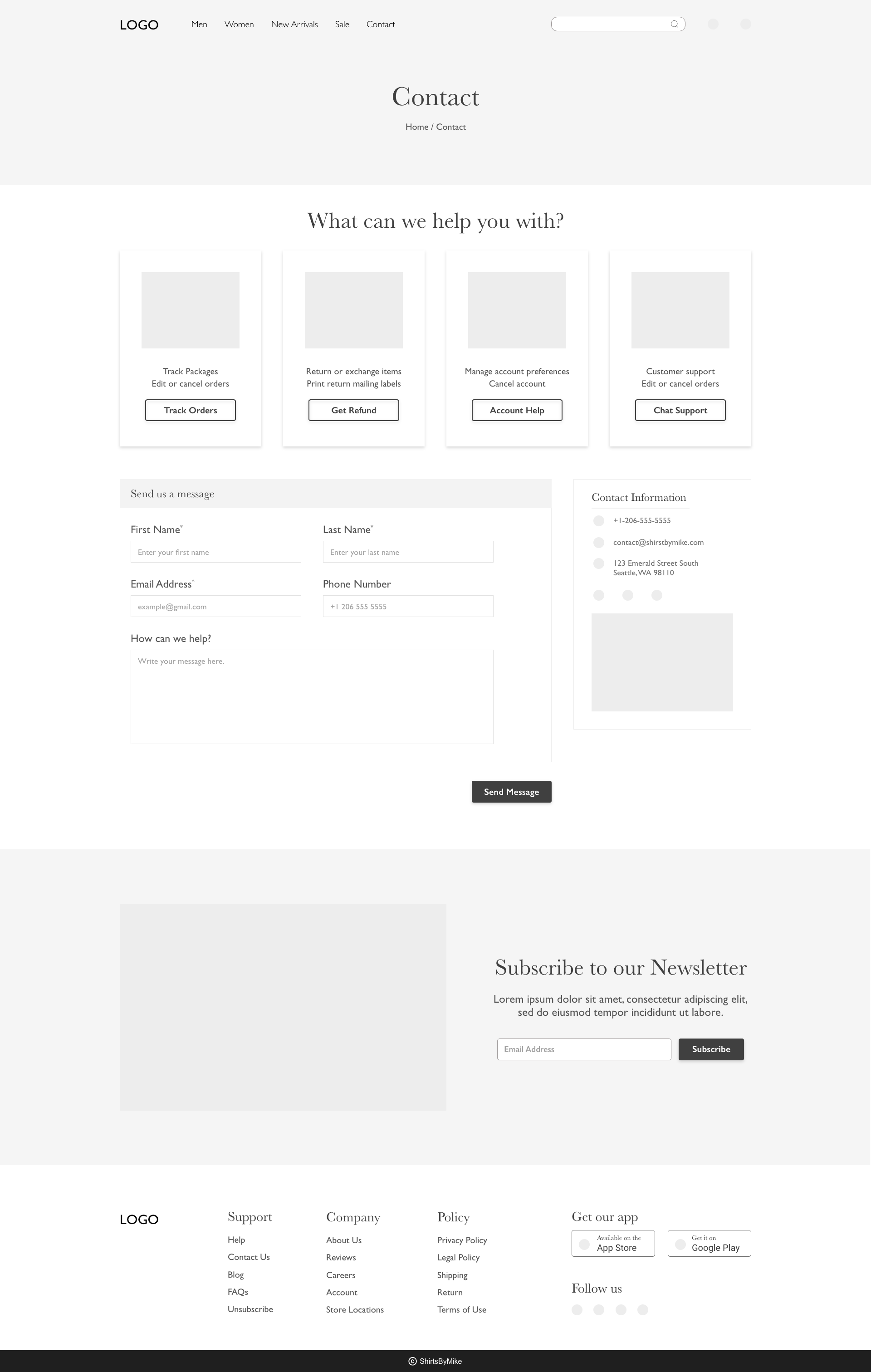
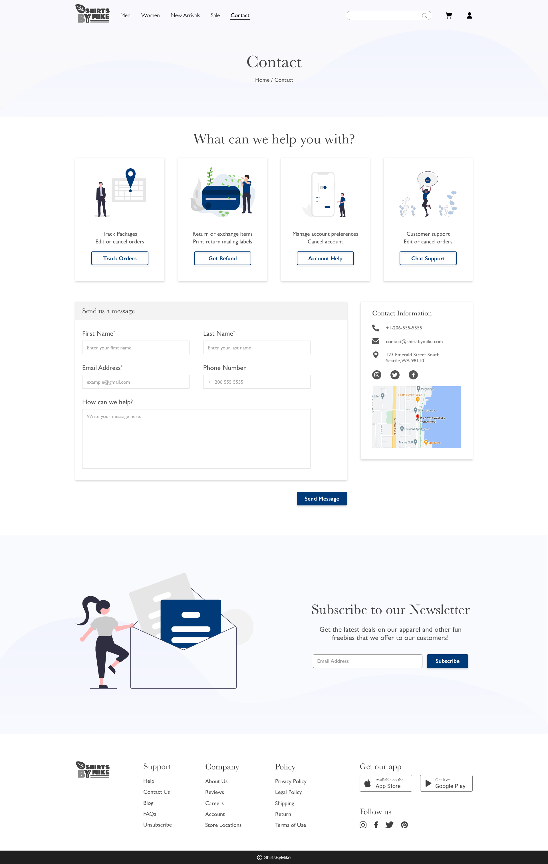
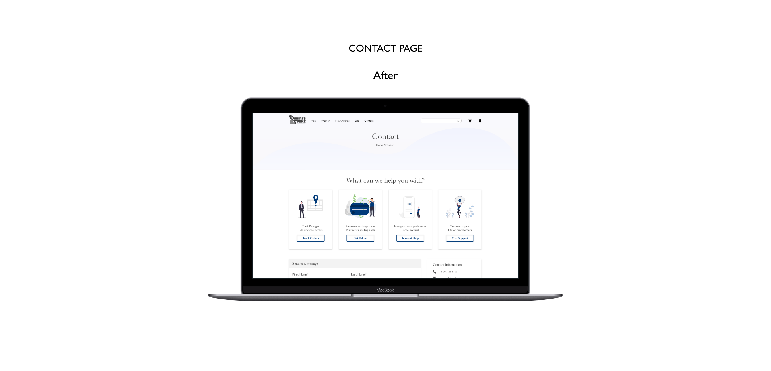
- Added quick links to track orders, get refunds and help with account, and contact information to help users easily access information they need without waiting on hold.
Final Mockups
Device Mockups
Summary
What did I learn from this project?
The most important thing I learned was the importance of research. Most often other companies have already found a way to solve the same pain point that your user might be facing. So it’s better to research and find features that are used as a standard practice to enhance the user experience.
Another thing I learned during this project was keeping the user and their pain points at the center of designs. I kept referring back to their pain points and it helped me validate the design decisions during each iteration.
Next steps:
- Create a prototype for user testing.
- Conduct usability tests and analyze feedback from the user testing to see whether the final iteration solved user’s pain points.
- Iterate on the designs to make user experience more fluid.